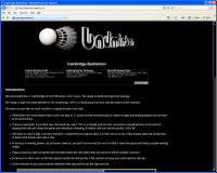
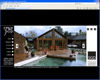
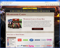
A website which has a compact form factor according to the clientÔÇÖs requirements and designed jointly by the client and myself to have rich graphical content. On entering the site, the visitor is presented with a white, letterbox shape which fills with a colourful floral scene, after which the menus are presented for navigation.
On less capable browsers like IE, users have a perfectly functional and pleasant experience with this site, but if they want to have a richer, more elegant experience, they need to start making more informed choices of browser. The intention is to have fluid navigation throughout the site with subtle transforms (on more capable browsers such as Chrome, Firefox, Opera and Safari). The right menu for example morphs from a wide section with content, to a narrow section when more space is given over to the gallery and other pages which require more space.
Not writing JS fallbacks for IE is by no means laziness, since as you will see, the site remains functional even when JavaScript is disabled. This thoughtfulness is not that of a lazy person.
The images are loaded stage by stage using prioritised image loading with the next most likely images from the users' possible navigation being loaded in preference to images which are more than a click away.
The whole site is a single page navigated by JavaScript, but it is still navigable and functional with JavaScript disabled, thanks to the server side scripting which takes over in this event. This should also aid search engine spiders in spidering the site and keeping it search engine optimised.
The projects section is a horizontal accordion and each pane in the accordion provides 6 thumbnail images which expand to fill the frame when clicked, providing a small gallery of the project. When the cross is clicked, the larger image slips smoothly away, back to itÔÇÖs corresponding thumbnail position.
The main image on each page has a subtle transitition where the background drops out of focus, leaving a small square or rectangle in focus.
Because of the rich photographic content, this site is not intended for a mobile audience, nevertheless, the form factor adapts when viewed on an iPad or a mobile device, preferably in a landscape view.
This is the third generation of this website for the same client.